Planning and Research

Friday, 4 January 2013

Film Magazine Research


Empire magazine is a well known British film magazine which is published by one of the biggest multinational media institution; Bauer Media. Bauer Media is a conglomerate company that is  a publishing and broadcasting company that serves areas such as Europe, USA, China and Russia. Although it is a huge conglomerate, there are issues that are rising within the magazine industry due to the improvements of technology. Magazines are now available online and through apps meaning the hard copies that are published may not get enough revenue to be able to advertise other products. Nonetheless this hasn't stopped Empire Magazine from publishing their well known magazine.

The masthead Empire Magazine has used creates a brand identity for the magazine. Having the masthead right at the top of the magazine is a typical convention of magazines. It allows the audience to quickly recognise the magazine due to its iconic font style and red font colour which could possibly mean more purchases, leading to a much larger revenue. As well as the masthead, about 90% of Empire Magazines font is really similar, or usually links into the font of the featured edition for example, if we take a look at the Inception edition it is clearly visible that the cover lines match the font style of the film title. 

Empire Magazine seems to have a certain type of house style in the way they lay out the cover lines and images on the magazine cover. Looking at the mise en scene, as an audience we can see there is a lot of similarity between these two published issues. The stance that both the male characters are positioned in are very similar, both seem to be giving some form of direct address with the body language but the actual gaze of the characters is not looking at the camera thus creating some form of identity for the magazine again. The cover lines seem to be positioned in the same areas as well, the fact that the cover lines are placed on either side of the main image on the cover page helps the audiences concentration be drawn into what is happening on and around the page. Another thing that seems to be a code that Empire Magazine follows is the colour scheme, both issues seem to have a Blue to White gradient working in from the edges into the centre, this is most likely used to capture the glance of the consumer as it forces the eyes to look at the title of the featured edition.

The magazine seems to be aimed at the mainstreamer's category on the psychograph because its all very hi-tech and glossy. The magazine covers seem to have this image of male power on the front cover which is very conventional in the genre of films that are being mentioned such as "Inception, Batman, Thor and X-MEN". Another reason the target audience will fall under the mainstreamer's category is because of the star persona on the front cover, the people in this category like to see people and stars that they know really well so having Leonardo Di Caprio or Hugh Jackman.

Friday, 23 November 2012

Storyboard

Scenes for Trailer


Setting, Costumes and Props

Settings/Locations


These three shots show the location of where my trailer will mainly be shot. Due to the several different angles and shots I will be using it will create an illusion that the area is slightly different meaning the audience will not be bored watching it. I would also like to shoot my trailer around the time when it is starting to get dark or just before that time to help create and atmosphere amongst the audience whilst they watch the trailer. This is following the conventions of several social realist films such as Kidulthood or Adulthood, the shots that are being used above are similar to some of the areas that appear in the films I have done my research on.

Costume

The costumes/clothing the characters in my trailer will be wearing will be somewhat similar to the clothing the characters are wearing in the shot above. The shot is from the film Kidulthood and because it is one of the main media products I had researched I want my media product to be quite similar to it, which will be following the conventions of the genre again.

Props

For my trailer I don't really want to use any props, due to the reason being if I was to use any props, they would be along the lines of some kind of weapon, which could lead to some difficulties filming in public even if it is a fake. Other than that the only form of props that my trailer would include would be mobile phones and nothing else. I want to be able to keep the trailer as simple as possible but still be able to make the trailer an enjoyable experience to watch.

Friday, 16 November 2012

Website Analysis


Ill Manors Website

Homepage: The homepage for the Ill Manors website is a strong front page. It instantly creates an atmosphere and mood for the film, which makes the audience feel like they need to explore the website. The heading at the top of the page saying "ON BLU-RAY. DVD, DOWNLOAD AND ON-DEMAND NOW" is a good way to get the attention of the audience and let them know about the films latest release, so before the film was released in theatres the heading would have had the release date on it whereas now it is telling the audience that the film is out on other types of media platforms, using the advantage of media convergence.

Interactive Site: The whole website is an interactive playground, using the arrows on either side of the image on the website you can move from the homepage to the page that seems to be empty but when you hover over certain areas with the mouse you discover there are links on the page. One of the links I have shown on the screenshot is the social network link, after hovering over the small pictures of the Facebook and Twitter the choice to click on them comes on. This is a good way of using media convergence because it is linking the consumers between there social network site and the film which makes them use the social network sites for more than one of the areas that come under the Users and Gratifications website such as Diversion and Surveillance. 

Conventional Uses: Although this website is a little different from usual film websites that you may come across, it does use conventions that other film websites use. These conventions have been highlighted in a red box in the image on the left. The conventions I have highlighted are the tabs on the left hand side, which allow the audience to see clearly what they can view on the website, the easier to navigate the happier the audience are which helps build a wider fan base, I have also highlighted the title of the film as well as the poster in the background. The title is a key part of the website because it clarifies what the films name is, it is also like a brand identity which helps the audience recognise the film instantly. The poster is something a lot of film websites include on the website, it links into the brand identity of the film but this website have used a slightly incognito way of incorporating the poster into the website. The credit block is also an important part of film websites, typically the credit block appears at the bottom of the page and this website has followed the convention.

Wednesday, 7 November 2012

Trailer Analysis

My Brother the Devil


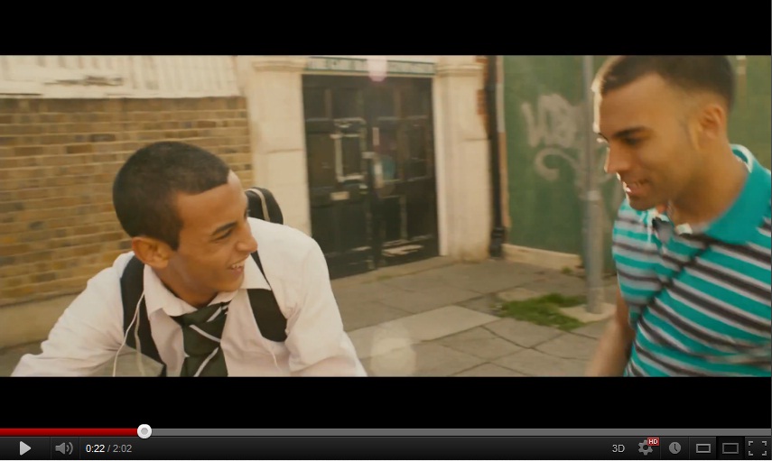
@0:22 - At this point of the trailer for "My Brother the Devil" the audience is exposed to the equilibrium between the two male characters. They are both smiling and it doesn't seem like anything is wrong. Also at this point the non-diegetic music is quite calm and relaxed which helps the audience realise that this is a state of normality. But there is a voice-over saying "the strong man is the who can control himself when he's angry" which gives the connotations of some form of danger that may occur in the upcoming scenes.


@0:38 - From this point of the trailer the audience is exposed to some form of disequilibrium, the fact the word "gangster" is mentioned connotes danger and violence. The fact that the three are handing out alcohol to each other gives the audience the idea that  the state of normality has been disrupted. Then this is followed by other shots showing how the young male is getting himself into a worse position by disrupting the state of normality even more.


@1:35 - Now we, as the audience see that there are several attempts to resolve this disequilibrium, but some of these attempts end up making more conflict and disruption to the equilibrium. The trailer is a build up to the climax where the audience start seeing all of the attempts to resolve all of the disruptions to the equilibrium.


Monday, 5 November 2012

Target Audience Research

My target audience will fall into band E on the demographic table, which includes people such as unemployed people, students, pensioners and casual workers. Clearly the majority of my audience will be students and a small minority will be made up of casual workers because they are the type of people most likely to watch a film based around social realism. On top of that, my target audience will be part of the explorers group and/or the reformers group as they are individuals who "seek discovery" and are people who have some form of "social awareness".

Wordle on what films they like that fall under social realism:

As you can see from both the quantitative results, my target audience will mainly be targeted at teenagers that are both male and female. Although the chart shows there are more females that had answered the questionnaire it doesn't necessarily  mean that more girls will want to watch the film. The theme of my trailer would have to be based around racism as the majority of people had chosen out of the other topics. Looking  at the qualitative results, I created a wordle to show me what films people had enjoyed watching. The films Kidulthood and Adulthood appeared quite a few times in the answers and had shown up on the worlde as did This is England and American History X. This is a good way to find out if my trailer should be somewhat similar to these films mentioned which would have a bigger and better appeal to the audience.

My audience will fall into Band E if we take a look at the demographic table. Being aimed at people who are very similar to the character(s) in my products (Trailer, Film Poster and Magazine Cover), the majority of my  audience will most likely be students and/or casual workers. The fact that both groups of people earn little to no money means that the film will not be overly priced in theatres and cinemas.
The audience I am targeting fall into the explorers category due to the fact that they will be watching a film that isn't a Hollywood blockbuster, instead they are exploring the film that is made by an independent company and production company. Not just the fact that my audience are only choosing an indie production over a Hollywood blockbuster, if you take a closer look, the explorers category states "Younger demographic students" which already links into the demographic band my audience fall into it.